Friday, April 30, 2010

Parade of Homes Inspirations

First off I want to thank Poppies at Play for hosting such a great parade! I had so much fun looking through all the homes and soaking up the inspiration! Unfortunately, now I have a major case of the "I need to redecorate" bug.

Here are a few things that really caught my eye.


Over at Stories of A to Z I am drooling over all the exposed brick in her home but there is something about that clock over her dresser that I L-O-V-E! I just might have to try and recreate it!


Now if you have never visited Pure Style Home you definitely need to head over for a visit! I was particularly impressed with her kitchen re-do. Love how she painted the old fridge with chalkboard paint. Brilliant!


And then over at Restyled Home I fell in love with the colors! I've always been a blue fan but I love how soft and pretty it feels in this room!


Now the brain behind Drab to Fab has some major talent! She turned the closet of her kids room into built in bunk beds! What a great idea! This would totally work for me since I only store my kids clothes in dressers anyway.


My jaw dropped when I saw this cabinet at Under the Table and Dreaming! I want it! Look at all the toy storage. Be still my heart!


And last but not least, Rare and Beautiful Treasures. I want her dining room! Look at the built in hutch. I cry a little looking at it, I'm that jealous.


Now I'm pretty proud of my little Ava's room, but look at this nursery. Can you believe that she hand painted those little pin stripes?!?! It is SO perfect!

Anyway, the parade was a lot of fun and I'm excited to get a post written up featuring a favorite room in my home to link up with tomorrow. If you haven't gone through the parade click here and start with house #1. All the homes are linked together for easy viewing and there are tons of great ideas out there!

Tuesday, April 27, 2010

Design School 101- Elements of Design

I hope you enjoyed the last installment of the design school series where we talked about the purpose of design. I'm hoping this is somewhat interesting and I'm not boring everyone to tears. Like I said before, I'm doing this for my own benefit since I've been out of school for awhile and need a refresher course, and I'm hoping someone out there may find it insightful.

Today we are going to talk about the elements of design. If anyone decided to take an entry level design course, you would spend countless hours learning and analyzing the principles and elements of design. I'm going to break this up into two segments and just go over the elements today. Still, we will keep it brief. I could probably do a post on each element but then I'm sure you'd be bored to tears!

I decided the easiest way to go about this is to take one designer and show off how she used different elements in her spaces. So all the images used in this post are from my favorite TV designer Candice Olson. (I will one day be as fabulous as her!)


Line

Line is everywhere. To incorporate line into design you don't have to go paint stripes on the wall, though you could. Line can be used in a window treatment, the back of a sofa, or a series of wall art. Basically, a line is any two points in space that are visually connected. Depending on the feel a person is going for, you can use lines in different ways. A vertical line creates formality, dignity, and a feeling of structure. A horizontal line suggests rest, tranquility, and a more casual feel. A diagonal line creates movement and activity in a space, and a curved line is natural, freer, and adds softness.
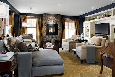


In this example room the long horizontal lines of the couch and entertainment center make the room a comfortable and relaxing space, while the vertical line of the window treatments and glass tile wall adds drama and elegance. What a great combo!

Shape and Form

The human mind is naturally drawn to shapes. In a seemingly random grouping the eye will naturally try to find shapes in them, such as a circle, square or triangle. Perfect shapes will feel very safe and balanced, and imperfect shapes create tension and interest. We can use this knowledge when placing furniture and accessories.
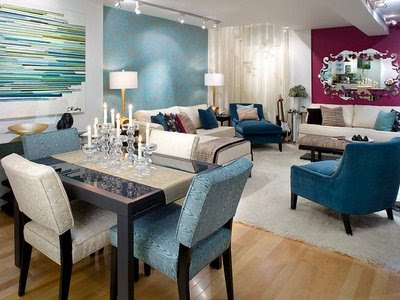


In this room we see many squares. The art is square, the table is square, and the seating group in the back forms a square. However it is broken up by the diagonally placed chairs, the round lamps, and the triangular form created by the candle sticks. By creating and varying the shapes in a room, the room has both order and interest.

Texture, Pattern, and Ornament

Texture and Pattern, while separate elements, are used in the same way. They create interest and can give emphasis to a particular object. Ornament is anything that is unnecessary for function but enriches a surface. All great spaces will have a mix of these three elements.
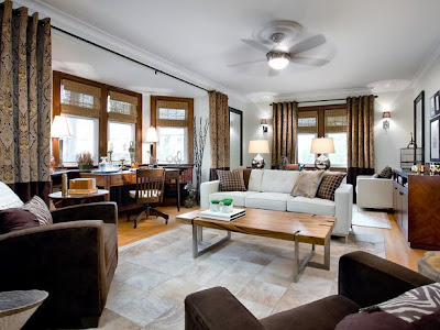


This is a great example of a room that uses texture and pattern to create interest. This room is very monochromatic and would be dull without the texture from the blinds, furniture, and flooring. The beautiful pattern in the curtains, pillows, and floors give the room focus. The result is a dynamic, yet restful, space.

Value and Color

Color is a major element in any design. It can be used to bring unity to objects, or to make an object stand out. Color can be used to create a mood, to create a focal point, to create balance, or to create interest. Value is simply the lightness/darkness of a color and can also be used to create balance and/or make a feature stand out.
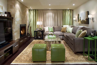


In this otherwise neutral room, the green color is used to add interest to the space, give focus to the windows, and help your eye visually travel through the space. There is a ton more we can learn about color and I'm sure I will someday do a design school segment dedicated to color alone.

Opacity, Transparency, and Translucency

The last three elements deal with the passage of light. Opaque object do not allow the passage of light, transparent objects do, and translucent objects are somewhere in the middle. Light is very important to interiors and we use these elements to control how that light is spread.
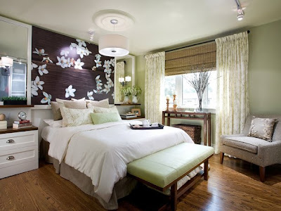


The most obvious source of light in this room is the window. A translucent window panel allows for soft, filtered light and the opaque blind help stop unwanted light. Translucency is also used to defuse the light coming from the chandelier. This is also a great time to note that mirrors, while technical opaque, are used to bounce light into the room and are a very powerful lighting tool.

So there you have it, the elements of design and how they are applied in interiors. In our next installment I will discuss the principles of design so be sure not to miss it! I hope you found this interesting and learned something that will help you analyse the spaces that surround you.

Friday, April 23, 2010

Heads Up

I found on my travels through blogland this great blog that is hosting a blog style Parade of Homes next week. She has twenty great design bloggers lined up to show off their homes. She is also following it up with a link party on Saturday so everyone else can join in on the fun! I'm so excited for the design inspiration that is sure to come! So go check it out and maybe I'll see you there ;)

Thursday, April 22, 2010

How I Met My House

Our Suburban Cottage is hosting a link party that I thought would be fun to play along. So this is the story behind "how I met my house."


Well... it was December and we were supposed to move out of this god forsaken, I mean lovely town we live in. But circumstances prevented us from getting out of here. This was our second attempt. We were living in a 1900's farmhouse at the time that was falling down around us. Our little guy (my first child) was about 6 months old and there was NO WAY I was going to let him learn to crawl in that house! So we decided to face facts, we were never getting away from here, so we might as well settle down and buy a house.

Well the house hunt began. It came down to three contenders. House #1 had a great location, great view from the back, and some charming features. However the previous owners were untalented do-it-yourselfers and we would have to re-do A LOT and it was a split level. (not my favorite floor plan) House #2 was the largest of the three and had a three car garage. It was on a HUGE lot, in a cul-de-sac, and was a ranch style home. The down fall was that it was very plain. It had golden oak cabinets (gag me) and was located in a not-as-nice neighborhood. House #3 was located in the nicest neighborhood of the three and had hardwood floors, alder cabinetry, and was the only one with a fireplace! I was in LOVE with this house but it was the smallest of the three, was a two-story so all the bedrooms were on a separate floor than the living areas, and it had the smallest lot of the three.

So which did we choose?

Well, remember that I am married and my husband had an equal vote in the choice. We ended up choosing house #2 because of the ginormous lot and three car garage. It was far from love-at-first-sight but my hubby assured me that everything I liked about the other house we could put in this house.

We have been in this house for 3 1/2 years. So far we have painted every wall, updated the hardware on the cabinets, put in stainless steel appliances, replaced all the lighting, re tiled the floors and counter tops in the bathrooms, put in a fence, painted the front door and garage doors, spruced up the flowerbeds, and completely finished the basement.

Here are some pictures of our home in its current state.


Things I still WANT to do is refinish all the cabinetry, put in hardwood throughout the kitchen and living room, install concrete counter tops in the kitchen, do a backslash, build a patio out back, and plant a bunch of trees. However, I worry about over building for our neighborhood so I'm not sure how much farther I should go with it. I guess we just have to decide how much longer we are going to stay in this house to determine if its really worth it. I am also considering some minor redecorating this fall as we've had the blue for almost four years and, well its still my favorite color, I'd like to try and use it in a different way, but that's another post.

Anyway, overall I am really happy with my house. We love being in a cul-de-sac, I love having a single story and I don't know how we could ever have less then a three car garage.

Thanks to Our Suburban Cottage for the fun post idea and link party!

Sunday, April 11, 2010

Design School 101- The Purpose of Design

Sorry its been awhile since I have posted, nothing really creative has been going through my head lately. Well, I guess that not entirely true, there are several big projects I want to tackle but I have to wait till the weather and finances cooperate. In the meantime I thought I'd start a Design School 101 series. Its hard to believe but I've been out of school for almost five years now and I feel like I need a refresher course, so I'm going to dust off my old text books and reteach myself the basics. So if anyone has ever been curious about the science behind design, here is your sneak peak into how the interior designers brain works.

For this first installment we are going to talk about the purpose of design. In the modern world we live in most of our environment in man made. Every space we enter is created for a purpose. Your bedroom is a place created for sleep and relaxation, your living room for family gatherings and entertainment, a kitchen for preparation of food. (you get the idea.) The first and most important thing to consider in any space is the function of that space. What will it be used for? Is the size adequate? Is there convenient circulation? Is the lighting and acoustics adequate? Unless the function is addressed, no matter how beautiful it may look, you don't have a well designed space.


Once the function is addressed you can move onto the materials for the space. Once again, when choosing materials the function is the most important consideration. Will the material function for the intended use? As I have learned the hard way, a stainless steel refrigerator, although aesthetically beautiful, may not be the best choice for a family with small children and grimy fingers. Is the material appropriate for the environment? You will not choose the same type of materials for a mountain cabin as you'd choose for a house by the ocean. Is the cost appropriate? Silk curtains that cost several hundred dollars are not appropriate in a playroom.


Once the function of the space is addressed, and the appropriate type of material chosen, then you move on to the aesthetic. Is it visually appealing? Does it create the intended mood or feeling? Once again, the function is always considered with every design decision made.


Lets put it all together now with the example of a bedroom. First we clearly define the purpose of the space. It is a space for sleep and relaxation. We than consider every activity that takes place. Do you read in bed? Do you watch TV? Is there proper lighting control? Do you have adequate storage? Once you get the basic function down then we pick the materials. Is the bedding washable? Are the bedside tables and dresser well made and durable? Do the window treatment provided the needed light control? And last the aesthetic. Are the fabrics and colors conducive to relaxation. Is the furniture aesthetically pleasing. Once all these combine we have a well designed space.


A favorite saying among designer is "form follows function." It is the most basic thing to remember in creating well designed spaces. One of my favorite quotes from my text book says "In an ideal world, every space that we enter and use would be designed not only to serve its purpose well but also to offer a visual experience that would be appropriate, satisfying, and even memorable." And that my friends is the purpose of design.


I know most of this is really basic and we all probably do this on a subconscious level anyway, but hopefully being made aware of it will help you look at your spaces and analyze your thought process a little differently.

Our next installment of Design School 101 will be about the elements of design. So stay tuned!

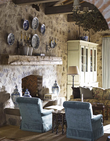
All photos used in this post are from the House Beautiful photo gallery.

Thursday, April 01, 2010

Kids T-Shirts with Bleach and Freezer Paper

I know I know... this is supposed to be a home decor blog. But my kids ARE in my home so I figure this still counts....right?

Anyhoo... I found this great tutorial at I Am Momma, Hear Me Roar on how to make custom shirts using freezer paper and bleach. It looked like a lot of fun so I thought I'd try it out. Here is what I came up with.


Pretty cute right?

My Ezra is a total motorcycle junkie. He lives and breaths all things "bikes." So I made him this "Moto Maniac" shirt.


I started out with a plain (and cheap) black t-shirt. I found the images online and printed them from my computer right onto the freezer paper. I then cut it out with an exacto knife and ironed the freezer paper onto the shirt. (shiny side down). I put some freezer paper on the inside of the shirt to protect it and sprayed the whole shirt down with bleach. Once the color had changed enough for me I rinsed it, pulled off the stencil, and washed.

The best part was how much Ezra loved it. He refused to take it off for almost three days and told everyone we saw that "my Mommy made me this shirt."

Since my Ava is into everything and enjoys emptying the drawers around the house more than any other activity, I made her this "drawer monster" shirt.


It didn't come out as sharp as Ezra's. I'm not sure if I just didn't get it ironed on as well but it could be because it took longer to change color and the bleach had more time to work on the paper. Either way, I still like it. It looks a little more rustic this way and fits my little drawer monster perfectly.

It was a fun project that was super quick and the kids loved. Can't beat that!

Friday, March 19, 2010

Pillows!!!

The greatest thing about making your own custom roman blinds is that you can make custom throw pillows that match! And the greatest thing about making custom throw pillows is that you can make them envelop style. So when grimy fingers use your pillow as a napkin, you can put the covers in the wash!


I made four covers to go over some existing pillows using the leftovers from my blind project. I then made two more "basket weave" pillows to accent with. They are so pretty! My pictures really don't do them justice. Isn't the basket weave divine?


So... do you want to make your own?

Supplies:
fabric (I got one yard to make two pillows and had some left over.)
ribbon (I used three spools of sheer ribbon per pillow but it will depend on the size of your pillow.)
pillow form
sewing notions


Step 1: Cut out a piece of fabric for the face several inches larger than your pillow form. You want to consider the fullness of your pillow and hem allowance.

Step 2: Cut out two more pieces the same width and about 3/4 of the length of your face fabric.

Step 3: Starting in one direction pin your ribbon in strips next to each other, pinning on both ends till you cover the entire piece.

Step 4: Start weaving by taking strips of ribbon and place them over, under, over, under... in the opposite direction. You will alternate every other strip. Once it is in place, tuck it next to the edge (or previous ribbon) and pin both ends. (I'm sure all of you know how to weave but I'm trying to make this thing thorough, but man its hard to explain in words!)

Step 5: Sew a top stitch as close to the edge as possible in order to hold everything in place while you work with it. Then trim around the piece. (At this point you could take some binding tape and bind the edge to make a beautiful place mat)

Step 6: Take your other fabric pieces and turn over and sew one of the edges. You may need to trim these pieces as well depending on how much you trimmed your face piece.

Step 7: Place the right sides together with the two back pieces overlapping. The turned edges should be in the center. Pin in place.

Step 8: Sew all around your pillow. Once done, clip the corners so they will be sharp when turned.

Step 9: Turn your cover right side out and stuff your pillow in. You may need to adjust the ribbon when done. And there you have it!

Note: the other pillow covers where made the using the same method as above.


Simply beautiful!

Tuesday, March 16, 2010

Dish towels that stay put!

I like to hang a dish towel over the handle of my oven door. When I have a dish towel out and ready, I end up using way less paper towels. This is good for the environment and good for my pocketbook. However, my 18 month old daughter WILL NOT LEAVE THEM ALONE! After picking them up for the hundredth time I decided I needed a solution. I remember my Mom having a towel with a crocheted top that buttoned to keep them in place, so I decided to make a more contemporary version of that. So, what do you think?


Want to make your own?

Supplies:

4 dish towels (one you will sacrifice for the binding and straps... I will refer to this towel as the secondary towel)
6 buttons
Sewing notions


Step 1: Fold your dish towel how you want it to hang. I folded the two sides into the middle and then the whole thing in half. Then cut out of your secondary towel a strip the width of your folded towel and about 4 to 5 inches long. Also cut out two pieces the width and length you want your straps.

Step 2: Pin your towel so that it stays in place while you work with it. Just be sure to place the pins low enough not to get in your way.

Step 3: I decided to leave my edges raw. (lazy) The edges will fray but I was okay with that. To keep them from fraying to much though, I did a zigzag stitch all around the perimeter of my pieces. If you want a cleaner look, you should cut your fabric a little larger and hem.

Step 4: Attach your straps to the back of you binding piece. I did this by sewing a square.

Step 5: Sew a button hole on the end of your strap. This was my first experience making a button hole and it was surprisingly easy.

Step 6: Align your binding with your towel. Make sure the straps are in the back and the binding is even on both sides. Pin and then sew in place by making another square around the binding.

Step 7: Hand sew on your buttons and your done!

There you have it. A dish towel that stays put!


So which one is your fave? (And no, I will not actual hang them all at once!)

Thursday, March 11, 2010

Roman Blinds

We recently finished our basement and I have been slowly decorating. We have a large family room down there with two big windows. Since this is our main TV viewing area I decided to make roman blinds in a dark fabric for ultimate light control. My mom has a pair of roman blinds in her house so I studied the construction and this is what I came up with.


Not to shabby huh?


It even looks great when its folded up at the top.


When I went shopping for fabric I fell in love with the print. Of course it was a remnant and they only had about a yard and a half. So I decided to use it as an accent along the bottom and do the rest a solid color. Although I love the final outcome, it would have been much easier to use only one fabric.

So do you want to know how to make your own? Well, okay then. Here is a diagram I made that should help you understand the basic construction.


(you can click on the diagram to enlarge)

Step 1: Measure your window and determine the size you want your blind. You will want to add a couple of inches to the width for seam allowances and about 20 inches to the length. Cut your fabric. *Because I did the accent panel at the bottom I decided to make my blind two layers so there would be no raw edges in the back. I cut out two panels per window.


Step 2: Hem the sides and bottom edge. If you are doing two layers, sew the right sides together and then turn.

Step 3: Now we need to make pockets for the dowels. This is where the blind will fold when it is raised. You need to determine how many you want for your blind and space them evenly. I used five. Using the dowels as a guide, fold your fabric so that a pocket is formed on the back side of the blind, pin in place and sew.


Step 4: Next trim your dowels down. They should be about an inch shorter than the width of your blind. Put them in the pockets and hand stitch closed. (For those who read my family blog, this is what I needed a hacksaw for.) This is what the blind should look like from the front at this point.


Step 5: Hand sew three plastic rings on each dowel. One should be in the middle and the other two about 4 inches from the edge.


Step 6: You need to get a 1x3 wood board cut to the width of your blind. Measure the exact height of your window and transfer that measurement to the blind. Place the narrow edge on the fabric at the right height and than wrap the fabric around and staple.


Step 7: Screw in a eye hook even with the plastic rings and an additional one a couple of inches from the edge you want your cord. (see diagram)

Step 8: Tie a knot on the bottom ring with your cording. String the cord through the rings above it and through the eye hooks and out. Do this on all the bottom rings. You should have three cords. (once again, see diagram) Place a blind pull on the end and tie off.

Step 9: Place the blind in your window and screw into place. We used three screws and pre-drilled holes to be sure we got it just right. Than place an anchor hook on the side of your window. When you open the blinds simply wrap the cord around the hook to keep in place.


There you have it, custom roman blinds.

Monday, March 08, 2010

A Bit of Spring

The weather is starting to turn and I am so excited for spring! I decided it was high time to retire the winter wreath on the front door. I made a simple spring wreath using a vine wreath from the craft store, some artificial apple blossoms and green ribbon. It was super simple but looks so soft and pretty. Ahhh... I love you spring!


EDIT: I was asked to give more detail on how I made this wreath. It was super simple. All you need is a vine wreath, about three or four bunches of faux apple blossoms, green ribbon, and a hot glue gun. Cut the blossoms off by branch and tuck into the wreath, gluing in place where needed. Be sure to go the in the same direction. Once the wreath is covered fill in any holes by gluing down individual blossoms. Make a simple blow with your ribbon leaving the ends about 18" longs. Then make another bow but cut the ends off this one. Glue the two bows together and then glue another little piece around the bow center to give it a uniform look. Glue it to the wreath and then tuck the bow ends into the flowers, gluing where needed. Hope this helps, if anyone decided to make this I'd love to see a pic!

LinkWithin

Related Posts with Thumbnails
Don't stop there! Click "older posts" to keep reading!