Today we are going to talk about the elements of design. If anyone decided to take an entry level design course, you would spend countless hours learning and analyzing the principles and elements of design. I'm going to break this up into two segments and just go over the elements today. Still, we will keep it brief. I could probably do a post on each element but then I'm sure you'd be bored to tears!
I decided the easiest way to go about this is to take one designer and show off how she used different elements in her spaces. So all the images used in this post are from my favorite TV designer Candice Olson. (I will one day be as fabulous as her!)
Line
Line is everywhere. To incorporate line into design you don't have to go paint stripes on the wall, though you could. Line can be used in a window treatment, the back of a sofa, or a series of wall art. Basically, a line is any two points in space that are visually connected. Depending on the feel a person is going for, you can use lines in different ways. A vertical line creates formality, dignity, and a feeling of structure. A horizontal line suggests rest, tranquility, and a more casual feel. A diagonal line creates movement and activity in a space, and a curved line is natural, freer, and adds softness.
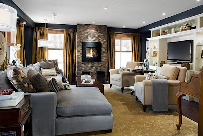
In this example room the long horizontal lines of the couch and entertainment center make the room a comfortable and relaxing space, while the vertical line of the window treatments and glass tile wall adds drama and elegance. What a great combo!
Shape and Form
The human mind is naturally drawn to shapes. In a seemingly random grouping the eye will naturally try to find shapes in them, such as a circle, square or triangle. Perfect shapes will feel very safe and balanced, and imperfect shapes create tension and interest. We can use this knowledge when placing furniture and accessories.
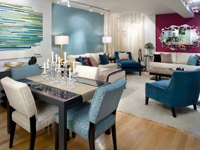
In this room we see many squares. The art is square, the table is square, and the seating group in the back forms a square. However it is broken up by the diagonally placed chairs, the round lamps, and the triangular form created by the candle sticks. By creating and varying the shapes in a room, the room has both order and interest.
Texture, Pattern, and Ornament
Texture and Pattern, while separate elements, are used in the same way. They create interest and can give emphasis to a particular object. Ornament is anything that is unnecessary for function but enriches a surface. All great spaces will have a mix of these three elements.
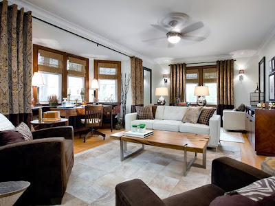
This is a great example of a room that uses texture and pattern to create interest. This room is very monochromatic and would be dull without the texture from the blinds, furniture, and flooring. The beautiful pattern in the curtains, pillows, and floors give the room focus. The result is a dynamic, yet restful, space.
Value and Color
Color is a major element in any design. It can be used to bring unity to objects, or to make an object stand out. Color can be used to create a mood, to create a focal point, to create balance, or to create interest. Value is simply the lightness/darkness of a color and can also be used to create balance and/or make a feature stand out.
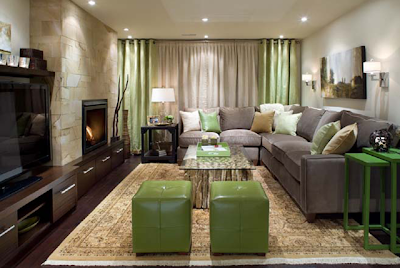
In this otherwise neutral room, the green color is used to add interest to the space, give focus to the windows, and help your eye visually travel through the space. There is a ton more we can learn about color and I'm sure I will someday do a design school segment dedicated to color alone.
Opacity, Transparency, and Translucency
The last three elements deal with the passage of light. Opaque object do not allow the passage of light, transparent objects do, and translucent objects are somewhere in the middle. Light is very important to interiors and we use these elements to control how that light is spread.
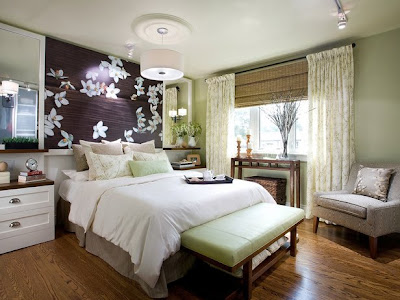
The most obvious source of light in this room is the window. A translucent window panel allows for soft, filtered light and the opaque blind help stop unwanted light. Translucency is also used to defuse the light coming from the chandelier. This is also a great time to note that mirrors, while technical opaque, are used to bounce light into the room and are a very powerful lighting tool.
So there you have it, the elements of design and how they are applied in interiors. In our next installment I will discuss the principles of design so be sure not to miss it! I hope you found this interesting and learned something that will help you analyse the spaces that surround you.


