Sunday, February 28, 2010

Princess Perfect

My baby girls nursery.

When I was pregnant with my second child and found out she was a girl, I was so excited. The main reason being that I could design her nursery! I think that doing a baby girl's room is so fun. I love all the soft colors and the whimsy you can create that wouldn't work anywhere else. I have a love for older, romantic styles and knew that was the look I was after. I saw this room done by Candice Olsen on HGTV's Divine Design and used that as my inspiration. (isn't it amazing?) This is what I came up with.


It all started with the bedding. When I design bedrooms I find that bedding is a great place to start because it is such a large element. I found the bedding online and its made by Cocalo Couture. It was the perfect combination of tradition and contemporary and in the color scheme I wanted, pink and green.


The walls we painted pink and the faux paneling was created with tape, white paint, and a very talented husband. I love the look and it was a great way to break up all those pink walls.


The dresser was actually my mom's as a child. It had been in every house I can remember growing up and was UGLY! It was painted cream, avocado green, and mustard. All it needed was a fresh coat of white paint and new knobs. I'm sure it has many, many years of life still in it. I put a cute cork board above the dresser and have cards and mementos from her birth displayed there. When I found the wire coach, I HAD to have it!


The changing table is a nursery necessity. I love having baskets with easy access to all my diapering supplies and toys. The bottom shelf is a perfect spot for extra linens. I painted a craft store shelf white and hand painted the motif from the bedding.


The letters that spell my baby's name I also painted using the bedding. It was intimidating when looking at the print as a whole, but when I broke down the elements piece by piece it was a cinch. The greatest compliment I got was when someone said "I thought it was wallpaper."


I also found some great princess art on PoshTots website. Since I couldn't afford so much as a knob from there, I decided to recreate them myself. They are simple, colored pencil drawings put in hand painted mats and white frames. I find that if your art is mediocre, a great mat and frame can make all the difference.


The window treatment really made the room come to life. I hung them floor to ceiling not only for drama, but light control. We have an arched window that streams unwanted sunlight in at the crack of dawn. The sheers behind were store bought and the green panels were made by me. They are simply constructed with the fringe attached by fabric glue.


I really wanted to put a crystal chandelier in here and this room would have been perfect for it. However, my baby was born in July and it was hot! We really try not to use the air as much as possible, so we decided a ceiling fan was a must. When I found this one at Lowe's, for under $100 no less, I felt it was the perfect compromise.


So there you have it, a nursery fit for a little princess.


Linking to:

 Poppies at Play.
The Lettered Cottage

Thursday, February 25, 2010

Don't Feed The Bears!

A Big Boy Room

Before the birth my daughter, my poor son not only got kicked out of his crib in order to make room for the new baby, he got kicked out of his room. The room we use as the nursery is larger and we needed all that space for the baby furniture so he got to move to a "big boy bed" in a new "big boy room." We were determined to make his room very special in hopes that it would make the transition easier. I think it worked because he loved his new room from the start. Wanna see?


We decided to go with an outdoorsy, woodsman feel. Our little guy is quite the adventurer and as a family we love the woods, so it was an natural pick. It all started with the adorable bedding* from Target and pulled all the colors from there. We thought natural wood was perfect for the look we were after and I LOVE all the toy storage under the bed.

*As adorable as the bedding is, it washes terribly. Most the time the comforter is folded up in the closet. Luckily my son doesn't sleep in the bed anyway, but curled up with his blankie on top. (It runs in the family) The sheets are still really cute so I don't mind so much.


I also LOVE the thick, dark brown window panels. They are not only the perfect color, but provide a complete black out when closed. Perfect for a little guy that is easily distracted.

Originally I wanted to do a feature wall with log siding so the room looked like the inside of a cabin. It would have been FABULOUS but after much thought we decided it was to permanent. We would have to replace all the sheet rock on that wall if we ever decided to change it and, for resale reasons, it just wasn't worth it. (although part of me still wishes we had.) Instead we took two colors of green, picked out of the bedding, a did a simple paint treatment. We did three walls in SW Ryegrass and the feature wall in a darker SW Relentless Olive. (found on the same color card to ensure harmony between the colors)


(Hi Max!)

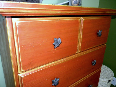
I than took a dresser we already had and gave it new life. We bought this dresser at Walmart for $99 several years earlier. It was a light color stain without any finish coat so it was super easy to change. I gave it a new colored stain, sanded the edges to antique it, a couple coats of poly, and new knobs.


It looks kind of orange in these pictures but it actually more of a burnt red.

I put the same knobs on the closet doors.


I than stained a shelf that I purchased at a craft store the same as the dresser. I painted on the words "Don't Feed The Bears." The snowshoes were my husbands as a kid and added the perfect touch.


We used antlers, bears, and anything with a rustic touch to accessorize with.


The teddy bear skin rug was to die for and a birthday gift from Grandma. Love You!


I found some star hooks and the perfect red star to hang behind the door. Its great to have a ready spot to hang coats and hats.


This vinyl wall quote was so perfect for my little guy that I just to find a spot for it.


What little boys room would be complete without glow-in-the-dark stars on the ceiling?


However, the thing I am most proud of are the letters that spell his name. I took a different plaid out of his bedding for each letter and did my best to copy it. They took HOURS but I think they are so special, even if a little imperfect.


So there you have it. The perfect room for our little man.


And because I can't resist, here is a flash back of the little man himself right around his first birthday.


What a cutie! I can't believe how much he has grown!

Saturday, February 13, 2010

Simple updates make me happy!

My new curtains inspired me to update the center piece on my kitchen table.


I took the bowl that I had my winter pine cones in and removed the stand, placed it on top of a teal cloth napkin and a spring garland, and then placed three pillar candles in the center. I then surrounded the candles with glass marbles. It looks so fresh and pretty!

Now if only spring would get here already!


*Designer Tip: When decorating with candles be sure to burn them for a few minutes so they lose that "just out of the wrapper" look.

Thursday, February 11, 2010

Vertical Blinds Alternative

I have a design dilemma. I have a bay window with a sliding glass door that leads to my back yard. When I moved in it was dressed with VERTICAL BLINDS. Yuk! I told my husband when we were house hunting that those would be the first thing to go. Well, that was three years ago and they are STILL THERE! Why didn't I get rid of them right away? Well, it was a little more complicated then I imagined.

Because I was dealing with a bay window, I couldn't hang regular drapes over the door without addressing the windows that flank it. I had to consider the bay as a whole and I ended up placing two panels of curtains flanking the bay itself. I was able to hang them about a foot above the actual window which added much needed height to that side of the room. I felt it was the best solution for the bay itself, but I still needed to cover the door for privacy reasons. Whatever I put in its place had to be fully and easily functional. Those doors are the only exit to the backyard and are used daily. Ideally I would have just used blinds or shutters but they just don't work with a sliding door. I even considered making my husband rip the whole thing out and put in a pair of french doors, but that was cost prohibitive. So the vertical blinds stayed and I just lived with them because they were functional.

Well, my kids forced my hand. The other day they thought it would be fun to pull EVERY SINGLE vertical slat down and broke at least half! I had two choices, buy more vertical blinds (which I couldn't bring myself to do) or finally come up with a good solution. Well, they say necessity is the mother of all invention and it hit me.
HANG CURTAINS ON THE EXISTING VERTICAL BLIND HARDWARE!


(sorry about the picture quality. I wanted to get a "before" image but it was the worse lighting imaginable. As you can see, the blinds were looking pretty sorry)

Here's what I decided. White sheers were going in its place. White because I wanted them to relate to the other blinds in the bay and sheer so that I could have some light filtering through. The fabric was actually very tricky. I wanted something that allowed some light but they needed to still provide privacy so they couldn't be too sheer. I also had to consider texture. I didn't want it to end up looking like a sheet! I found a nice, white gauzy fabric (it also happen to be on sale for $2 a yard!) and I was set.

* Please note: I am a very beginner seamstress and a very lazy one. I only measure when absolutely necessary and will cut every corner possible. If I can do this, ANYONE can do this!

Here's what you do. Measure the height and width of your door. Mine was seven feet high by five feet wide. You need to add extra width to give it some fullness so I added an extra three feet. (Remember to add a couple of extra inches for seam allowances) My fabric was four feet wide so I was going to have to piece two panels together. I placed the right sides together and did a simple zigzag stitch and then trimmed my fabric as close to the seam as possible. (Yes, I have a raw edge but it made the seam the least noticeable.) Then sew a simple hem on the two sides and the bottom. In order to hang my panel to the blind clips, I was going to add rings to the top. To reinforce where the rings would go I folded the top down about a inch and hemmed. (A) This made the area double thinkness. I then did a top stitch above where the rings would go to reinforce the top. (B) For the rings I got 3/8" eyelets and a setter. I took the width of my panel and divided be the number of clips I had and determined I needed twenty one rings every five inches.(C) Follow the directions on the box and set the rings. I placed a cutting board beneath me to protect my counter but please consider the surface you are working on. DO NOT do this on top of a stone/tile counter or floor! You have to hit your setter with a hammer fairly hard and several times.


Once your rings are in place you can hang your curtain. I clipped each ring into the clips alternating the direction so that it made a wave. Thats it! It was so simple...


Ahh... and so much better!


The best part? Fully functional and cost less then $30! Gotta love it!

Wednesday, February 10, 2010

Welcome!

Welcome to Sassy Sanctuary, a place for sharing things that inspire me, projects I am working on, and to bounce around design ideas. I have some exciting projects coming up including window treatments, pillow covers, and a handmade clock. I plan on sharing some of my favorite past projects, including my kids rooms. It has been four years since graduation from school (hard to believe) and I need a refresher course! So I also plan on doing a design school 101 series. I hope you will enjoy this blog as much as I enjoy having someone to share my ideas and creations with.

LinkWithin

Related Posts with Thumbnails
Don't stop there! Click "older posts" to keep reading!